Tabletop accessory
Designing a simple physical token that solves a real table problem
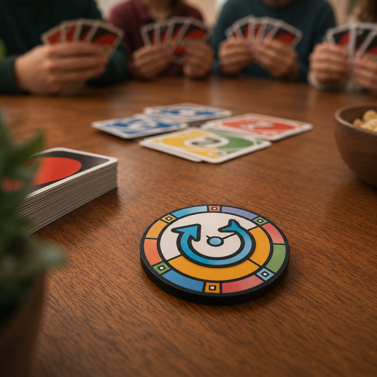
Play Order Token is a tabletop gaming accessory designed to make turn direction easy to see at a glance. The product uses a two-sided token, with clockwise on one side and counterclockwise on the other, so players can flip the token whenever a game changes direction.
- Product concept
- Tabletop gaming
- Crowdfunding
Project snapshot
- Type
- Physical tabletop accessory concept
- Focus
- Product design, usability, form factor, campaign strategy
- Product question
- How can a small table object reduce confusion during casual games?
- Status
- Concept, product direction, and campaign planning
The challenge
Many casual tabletop games change the direction of play, but the current direction is often tracked informally through memory, repeated reminders, or table chatter.
The product needed to be immediately understandable, inexpensive enough to share or gift, and attractive enough to feel like a useful table accessory rather than clutter.
Product approach
Scott explored the product as a simple two-sided token: clockwise on one side, counterclockwise on the other, with clear directional arrows and a strong visual difference between sides.
The concept balances usability, theme, manufacturability, and campaign flexibility by considering multiple form factors, including enameled coins, challenge coins, poker chips, foiled card tokens, cardboard tokens, laser-cut wooden tokens, and print-your-own options.
- Clarify the core job: make current play direction visible to everyone at the table
- Design both sides of the token to be readable, distinct, and easy to flip
- Evaluate multiple production formats for cost, perceived value, and giftability
- Plan crowdfunding reward tiers that support both premium buyers and casual backers
- Use in-context renders to test whether the product feels natural on a real game table
Campaign strategy
The campaign direction focuses on a narrow first launch with a simple funding goal, clear reward levels, and enough visual polish to help backers understand the product quickly.
A Kickstarter-exclusive indicator, thank-you tokens, and premium collaboration-style reward options create room for scarcity and community participation without overcomplicating the first campaign.
- Keep the first campaign small enough to fulfill reliably
- Use stretch goals to improve materials or finish rather than expand scope too quickly
- Offer approachable versions for gifting and premium versions for collectors
- Treat campaign imagery as both product validation and marketing material
Assets & Visuals
Key diagrams, documents, and reference materials.
Outcome
The project demonstrates Scott's ability to move from a small observed problem to a tangible product concept, connecting user need, physical design, manufacturing options, and launch strategy into a focused product story.